Saturday, February 28, 2009

Bhunga Homes of India

Just discovered a gorgeous blogger, Vineeta, over at artnlight. She posted about the mud homes of Gujarat in India, and I had to gather up the beauty right here. Her post is much more informative, so give her a looksee.

These are homes created by indigenous people, these are not designer rooms created by someone being inspired by Indians. This is the source. This is far from American, far from contemporary, and I like it. To be truthful, I don't think I would make my own house to look like this, but there are things here that inspire me. I love the tone on tone texture of these embedded mirror decorations. I love the pops of color. I love the intricacy of the pattern.

I think it's the bohemian in me, the hippie child, the rainbow baby that loves the Indian patterns. I once bought my sister a quilt of antique Indian fabrics. It's still hanging on her wall, I think. I love the deep colors, reds and golds and browns and purples.

I have moved away from the more elaborate design myself. I've been leaning toward more serene spaces, less clutter and collection, fewer swirls and ornamentation... but I still love this.

I think there's a way to combine the richness and detail here with a more modern, sleek design.

Actually, I think it fits with my philosophy of life.

It's easy to get carried away with all the beauty of stuff, with wildness and ideas and desires. But if we can find a way to contain the exuberance, we can avoid being overwhelmed. Just because you want to be more zen doesn't mean you can't enjoy the bounty of life, does it?

Even in this house you can see it. The neutral background, the straight and simple lines, the humble materials, put together with the amazing designs and lovely colors.

Just think about it. Chocolate is wonderful, but if you eat it all the time you get sick and fat. If you savor small pieces as sometimes treats, it's one of the great joys of the world. I don't think I'm exaggerating the appeal of good chocolate, either.

Wednesday, February 25, 2009

Imke Klee


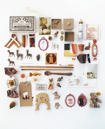
A photocard by stylist Imke Klee, found via Visual-Notes, a lovely blog.

I've been seeing these things all over the internet, and every time I do, I get the almost irresistible urge to gather up my collections and start photographing them on a white background.

And then a messmaker or two comes barelling through the room with peanut butter fingers akimbo yelling like a banshee and swinging a light saber, so I never get around to it.

I still love the idea of documenting loved and beautiful things. I love the ideas of collections. I love the idea of coordinating a color theme with them, to give some unification of the disparate items.

Looking at this one here, though, I start getting an idea to allow the things within them to not be random, but to tell a story. These little animals put me in mind of fairy tales and getting lost in the woods. I feel like there should be a red riding hood in here. But that wouldn't fit with the color tale, would it? She's got more color collections in her flickr photostream.

What kind of "random" items can come together to create a mystery? I am intrigued by the concept, although I might never get the opportunity to try it until the kids are in High School.


Look at that. There's a whole flickr pool for organized collections. I have got to figure out flickr. Any suggestions for an overwhelmed newbie?

Tuesday, February 24, 2009

Diane Benezech-Schuh

Art by Diane Benezech-Schuh

Beware of stepping through this portal, Hibou-Caillou-Chou, you might be swallowed by the whale. She paints clothes, makes other cute things, and has an etsy shop

I have that funny feeling in my stomach that I get whenever I stumble upon something magical.

I found this site through an interview on Lou Lou and Oscar and could not get away.

Friday, February 20, 2009

Excellent Tutorial from Blogland

Little Green Notebook is a recent find of mine and I am terribly impressed with Jenny and her window shade from cheap mini-blind tutorial. It just is a brilliant idea as window treatments are so ridiculously expensive.
I have always liked a simple look to my windows, but sometimes you need something more than just bare, and maybe I need to do more than the white eyelet table cloths I had tacked above my windows for so many years. I liked the country feel, but I'm feeling the need to go a little more tailored. This might fit the bill. I wonder if eyelet tablecloths would look good as shades? hmm.

Thursday, February 19, 2009

Inspiration Lost and Found


This is pretty amazing, by French stylist Camille Soulayrol, found via Apartment Therapy NY. You would have to have some pretty large ovum to actually have that in your house, though. It would be easy to mistake that kind of creativity as ramshackle. I still don't know if I would do it. I think it might be a little too rustic for my tastes. Maybe if it weren't raw wood, but then, isn't the raw wood just-tacked-up-there feeling part of the appeal. The red birds are what make it look deliberate, in my opinion.

Maybe if it was a mix of painted woods? Maybe in the white/blue/gray range, something subtle, but not feeling like it was pulled off of packing crates? The bench and the boots help to pull it together, too.
What I like about this picture is actually something I lost. I had a book case that looked like this, but dark wood. It also had glass doors on it, but the glass doors were misaligned and wouldn't close and I was getting frustrated with the whole thing, so I left it behind in NY. Of course, now I can see the lost potential. Why didn't I just take off the doors, strip the worn finish and paint it?

Shoot.

Wednesday, February 18, 2009

Do I Like My Junk Mid-Century Modern, Country, or Rustic? Yes, Please.


Fun with quizzes and browsing inspiration pics of houses from Sproost! You can go over an tryi it out. Apparently I like Vintage Modern, Cottage Chic and Rustic Revival, and all told that means I like junk. Which is true, so it's all good.

Found through new to me blog, this young house, which was found through new to me blog, bohemian hellhole. Both really cool. I'm enjoying this new hobby of imaginary decorating.

Tuesday, February 17, 2009

Abundance For All


I am loving Jess Gonacha's new blog... Pecannoot. The whole philosophy behind it is to focus on the abundance in a world that is fricking FREAKING out about not having enough.

But the truth is, we never have enough, when we look at it in that light. And we always have enough when we focus on what we actually do have.

It doesn't mean you have to settle for things that suck, but it does mean you live the life you have in the moment and appreciate it.

I've been thinking lately that although there is no guarantee that thinking positive will result in a positive end, I am pretty sure that if we go around thinking negatively, we will be miserable, even if we do get the happy ending. And we probably won't be satisfied with the happy ending, anyway.

Which one sounds better, being happy living your life even if things end up badly, or being miserable with your life waiting for things to turn out right, and then being miserable anyway?

So hop on over to lovely Jess' new abundance spot and revel in how you already have all that you really need.

Oh, she's also looking for submissions from artists who are celebrating abundance in their art. How is that for practicing what you preach. Nicely done, Jess.

Monday, February 16, 2009

In Which the Author is Revealed as a Reality TV Junkie


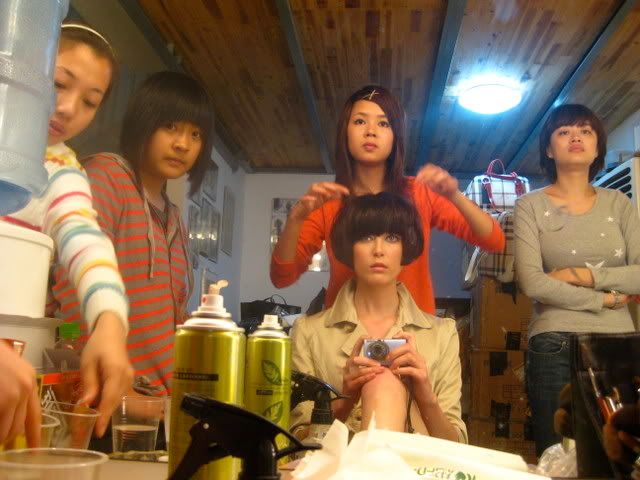
Uh uh. I just found Elyse Sewell's live journal. If you are a pop junkie like me, you will remember her as the girl that should have won America's Next Top Model... I do believe season one. Season ONE? So long ago?

Now she's a bonafide model, living the life in Asia. I guess she gave up on the idea of going to medical school.

I just spent half my morning reading her blog. I found it funny, if a little snarky, but that's the voice I remember from yesterboobtube. It's also kind of interesting seeing the cultures she encounters. I think she's lately in Shanghai.

This isn't really about design or living small or being heartfelt, but I is who I is, and I watch a lot of tv. A little bit of living vicariously isn't a bad thing. Keeps me from spending money. Plus I get the feeling that modeling isn't as glamorous as it appears on the surface, which is true of most things.

ANTM is one of my favorite reality shows, after So You Think You Can Dance. Which I swoon over. I can't wait until it starts again.

Friday, February 13, 2009

Lena Corwin Wedding

I love this wedding here. It looks so laid back and casual. And yet, the style is evident. That's really what I'm looking for. Despite already having kids and having been together for about 5 years--- actually, not despite, BECAUSE of this, I want to have a wedding that really reflects us and our lives. I am too old and have already been through too much to want that princess thing, or even that "best" day of your life that is "all about you."

In this picture, I think her dress is adorable. I like that he's just in a suit that shows his character. I like the little banners fluttering in the breeze and the backyard setting.
Look here. Some rented tables and linens. A refreshment table in the background that looks like it holds a bowl of punch or sangria? I like. Fairy lights in the trees. Maybe some people think fairy lights are corny, but I don't care, I still like them. I would keep a Christmas tree up year round for the lights if they didn't drop needles everywhere and take up half the room.I like the lounge chairs here, and the blankets set out for picnic resting. There's nothing more casual than really getting close to the ground. And laying in the grass, staring at the sky and the trees waving in the breeze is one of those experiences that serves to renew me.
This is a cute idea, too... to set up a little photo shoot for everyone. Fine, it's not the tres cool photo booth, but I don't think one of those is in my budget. I like the patterned background though. And you could have different backgrounds, too. Plus, I always carry my little Casio Exilim camera with me wherever I go, so the snappity snap of a point and shoot is part of who I am. Have I mentioned that I plan to take pictures throughout my whole wedding? Bad idea? I may not want to take pictured, may be too busy, but I do love to take pictures.

Other elements that would need to be there? Things to entertain kids... I'm thinking bubbles, crayons, balloons. Some good jazz music. Easy to eat foods... I'm thinking Spanish tapas, sangria, paella.

Sometimes I don't like to talk about my wedding plans, because it's kind of far down on our list of priorities, but when we do decide on a day/place/time, I have a feeling it's going to happen pretty quickly. I'm not really interested in a long drawn out planning process. I am certainly not interested in the wedding industry. So I might as well think about it, plan it in my head, decide what I'd like, and then, all those decisions will be made when it's time to actually go about it. This isn't a situation that would work for your traditional bride, I think. But I'm not traditional, so... lucky for me.

And it's no coincidence that this wedding belongs to the super talented, uber stylish Lena Corwin. Found via Smitten, by Joanna Goddard.

Thursday, February 12, 2009

Swoon

I'm a little in love with this artist at LittleRobot. Her name is Lindsey Carr and she has a blog, here, too. Let me tell you, it was hard to pick which images to show, because they are all swoon worthy.

I picked this one, Flight, because it reminds me of my Flying Girls. Not in style, obviously, but well... it's a flying girl. She has a sister, too.
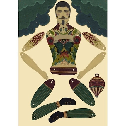
And I wanted to show one of these puppets, too. They are fantabulous. They make me feel like I have fallen down a rabbit hole and into a strange and magical land. This one is the Strong Man. You can assemble him yourself. It reminds me of how I had my HS students create puppets to represent Shakespeare characters in The Tempest.

I found her through The Explorer's Notebook and Allison Murray's great etsy treasury. How does one get one of those, anyway?

Tuesday, February 10, 2009

White and Pink? Not usually my thing. But I love it.

Would this image be as cool if it weren't in a 20 foot tall room? If it didn't have that neato worn cement floor or those awesome double doors and that amazing brick ceiling?

I'll tell ya what I like. I like the raspberry couch and the teal next to it. I like the green door coffee table, and the round pottery. I like the ladder turned into shelves and the guitar in the corner. I like the rough edges and the white walls. Again, it reminds me of being a kid in the 70's, growing up a rainbow baby. Ah, the hippie days.


By the way, this is from sfgirlbybay's ode to pink from her Deco files. There's also this one. I could totally see creating a room for my little girl out of something like this. It also makes me want to start collecting striped sheets. I remember a very similar striped sheet from when I was a child, although I believe it was gold and yellow. There was another sheet in green and blue. Am I going on a nostalgia kick, brought on by the loss of Domino?Then there's this one. This is totally not my style, way too formal and girly, but it stopped me in my tracks. I do love the deep rose of that velvet couch, and the black and white peacock painting took my breath away. Something about it reminded me of that scandalous Madame X painting by John Singer Sargent. And the white walls are nice. So is that immense secretary desk.

Monday, February 9, 2009

A Room/Closet/Corner of Her Own


I like this closet work space, found via pinkshirtsandcarwrecks. Very inspiring. You don't need a big space to have a room to call your own. (Actually, I like the whole place. It reminds me of my parent's hippie apartment in the 70's for some reason.) In fact, I don't have a room at all. I have a corner. But even if it's a corner, it's worth making it so that it feels like home, beautiful, peaceful, creative.

This is what I have now.
Aside from the fuzzy photo. I think I could do better. I need to work on the organizing a bit. I like the wall pencil holders, and I'm pretty sure I could make something up out of found materials for that one. Wouldn't it be cool to be a potter, just so you could make stuff you wanted out of clay? I also like the color. Bright is nice.

My desk is next to a window, so I can already see trees, but I think that the curtain with the trees printed on it is a good substitution for getting that natural feel. A large print or painting might also work, if one had a workspace in a closet. As does the mirror, bringing in reflected light. Good solutions. Actually, the green below/blue above color also serves to bring that bright outdoor feel into the small room. Frances really seems to know what she's doing.

Sunday, February 8, 2009

When One Door (Shelter Mag) Closes, Another One Opens

Upon the demise of my favorite magazine, I've decided to make my own.

Haha. Okay, well, not quite. But I've decided that this blog, small and heartfelt, will be my substitute magazine. This is where I will collect the great ideas I see on the web. The wonderful artists, the inspiring rooms, the beautiful outfits. The clever ideas. The awesome things made by awesome people.

It's the place I'll go when I want to be inspired.

I'd like to add in some of my own content, too, but that may be more difficult, as my camera is not taking very good pictures, and my life is a bit chaotic with all that I've got on my plate. But, maybe the challenge of trying to see the beauty wherever I go will be what I need to understand the order that's already there.

It will probably take me a while to find my groove. To figure out my links and my categories. And where exactly I want to go, but I think I will have some fun as I develop it all. The worst that can happen is that it doesn't fit with my life and I decide to stop posting. That's okay. It's a labor of love anyway, a hobby, something I do for myself. I want to have fun.

I decided to become a novelist one summer when I had no books to read. Maybe I'll become a publisher, now that Domino is folding.

That's a joke. But it's still the truth. If I can't find something out there to fit my needs, I'll make it myself.

Wednesday, February 4, 2009

Some Inspiration to Thrift

Just found a whole bunch of inspirations over on sfgirlbybay as she mourns the loss of Domino. If the website was going to be around, I would have just saved it to my decofile, but alas, alas, alas... I guess I'll just have to do my collecting here.

Love this living room. The white and the brights and the books. Oh I love a room with books. No room really feels finished to me without some books, somewhere.

I am planning to do a lot of decorating soon, as we get a new place, probably a cozy cottage with lots of light and an fenced in back yard for the kiddoes to romp, if I have my druthers.

But since we got rid of almost all of our furnishings, leaving only our library and art and clothes (pretty much) it all has to be done by scratch.

That's kind of exciting, actually. I am looking forward to the hunt. I promise to post about it here. This is one of the reasons I started this blog in the first place. In anticipation of decorating a house.

But don't think that I'm going to be about linking to thousand dollar chairs and ten thousand dollar light fixtures. I won't-- unless I found a way to hack the style from discards found in the alley and yard sale discoveries that get covered with a coat of glossy blue paint. I'm more likely to show cool rooms that I take as inspiration and photos from my estate sale excursions.

I'm drooling just thinking about it. Hey. Here's a preview. I photographed this on my last jaunt (a long time ago.)
It's a little well loved, but I thought the colors and pattern were beautiful. I ended up giving this to my mom to buy, and it lives in her blue and yellow kitchen, now.

I only had 24 dollars that trip and got a lot of lovely things, but there were things I left behind because we don't always NEED the things that attract our attention. I found it was fun to have a little photo safari, taking photos instead of purchasing. Just like on the savannah... take a picture of that elephant, don't shoot it.

I'm getting my jones on for the thrifting again. Actually, it's a good idea to keep a small budget like that for impulse shopping, because it would be so easy to just snap it all up. At 24 dollars, you have enough to get things you really love, but not enough to be impulsive and start collecting crap again. It took me 5 years to get rid of the detritus. I vow to not collect stuff I don't really love or really need, ever again. Of course, I do mourn some of my loved items that I had to let go of, but that just leaves room for new loves, doesn't it?

For the room above, I will be on the look out for a heavy textured large bedspread, cotton, so it can be tossed in the washer (two toddlers, remember?) a shapely chair, a poof or ottoman (or stack of pillows, which might fit my needs best, honestly), a sinuous lamp, a bright red oriental rug, just a simple coffee table (I miss the mid century modern one we left behind), oh, and a nice cabinet... or a crappy one with good lines that could take a pop of colorful paint. The shelves just look like ones from the hardware store, absolutely nothing fancy.

The toughest thing to find on that list in my experience with thrifting? The rug. I must keep a sharp, hunter's eye out.

Pink and Orange Celebration


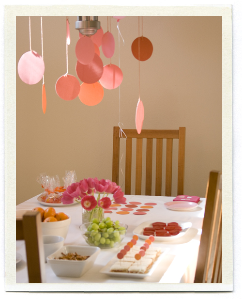
How adorable is this birthday party that I found over at Inchmark? I love these colors and the polka dot theme is simple and festive. This party is for a three year old girl, but I think it could be adapted for any celebration, from a baby shower to a casual, fun wedding. Fine, a wedding might be a bit more elaborate, but it's all about the ideas.

And frankly, I think contemporary weddings are way too big and over processed. A nice little home made wedding like you might have seen a couple of centuries ago... a celebration and acknowledgment of the union of two people in a community... that's a wedding, not some princess fantasy. Okay, enough of my philosopoophizing. :)